
Last year, one of the landlords for whom we managed, surveyed our growing vacancy board and proclaimed it “rentpocalypse”. In response, I looked at data from our monthly rental report that is published in the Abilene Reporter-News to make choate his observation. What we discovered was 2016 relative to 2015 was a tough year; homes remained empty longer when compared to the prior year.
This table, taken from these monthly reports, summarizes this landlord’s apocalyptic observations:
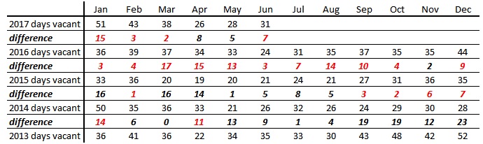
Numbers in red are bad – they mean more time on the market compared to same month in the previous year. When evaluating the data:
- Consider February in each year. In 2014, an Abilene rental sat empty 35 days, in 2016 it sat empty 36 days, 39 days empty in 2016 and 43 days empty in 2017. The red numbers that tabulate difference show that since 2014, February rentals stay on the market longer with each passing year.
- The average Abilene rental in September 2014 sat empty 24 days. Move ahead one year and we see that an average Abilene rental in September 2015 sat empty 27 days – a 3 day slowing between 2014 and 2015. Notice that a slower rental pace is the trend when we consider the 9/2014 v. 9/2015 differential going forward to the 10/2015 v. 10/2016 differential. The pace in November 2016 reverses this trend with a 2-day gain over November 2015, but then we dive back in with a slower rent pace that improves for two months (April and May of 2017) and then loses steam in June 2017.
I took these observations back to textbook supply and demand. On the demand side:
- we see stable demand for housing due to the institutional money that defines our market. The backbone of our economy comes from large public and non-profit entities like Dyess AFB, our hospitals and care facilities, higher ed and an occasional bump from the oil field that is just a little far west to really make a difference in our economy.
- our population grows at about 1/2% a year. This follows from an economy that doesn’t depend on the entrepreneurial sector, but instead relies on the public & non-profit sector to generate income (it’s the kind of stability that would make a good socialist with a bent for central planning green with envy).
On the supply side:
- Housing experienced an implicit drop in price when the prime rate fell to 3.25% in 2009 and stayed at that rate until February 2016 when it rose a quarter point. Currently, the prime rate is at 4.13%.
- While we have no measure of this enthusiasm for rentals (and measurement of investor confidence is truly the holy grail of economic work), anecdotes tell us that borrowers felt rental property was a strong investment bet. In 2016, Investors fell prey to the fallacy of composition that swelled supply and aggregated into more days rent houses remained vacant due to competition.
While the animal spirits of real estate investors aren’t measurable, the consequences of their enthusiasm is revealed in real estate transactions they book. Last summer, Barnett & Hill researched this connection. The Landlord’s Invisible Hand utilized Taylor CAD data to investigate the growing rental sector in Abilene since 2003. Where are the Abilene Rentals? used the same data to compare a map of 2016 rentals to 2003 rentals to visually gauge the growth of local rentals, street by street. This year, we’ve added data for 2017 plus a few new maps that highlight neighborhoods with rentals.
Let me clarify what we are calling a rental. Taylor CAD keeps an inventory of properties with a homestead exemption. Homeowners have an incentive to file for this exemption because it reduces the homeowner’s tax burden. Therefore, we feel homes that do not carry the homestead exemption are a reasonable proxy for rentals.
I parsed the data three ways: first for Abilene as a whole and then a tally for Wylie ISD and Abilene ISD. Since the AISD boundary change of 1993 described in Who Moved My Equity: The Price of AISD Boundary Changes, Wylie ISD has grown at the expense of Abilene ISD, so it is helpful to consider the data in the context of school districts.
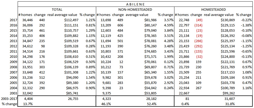
First, the town-wide results. Between 2003 to 2017, Abilene gained 4,404 new homes. Of the total – both new & used – added since 2003, we have gained 4,323 new rentals. The net result: we have gained 81 new homesteaded homes since 2003. Abilene’s peak year for homesteaded homes happened in 2009 with 23,898 homesteaded homes and has subsequently decreased. This data reiterates the significance of 2009; the 3.25% prime rate that started in 2009 and persisted for 7 years made rentals more accessible for aspiring landlords to enter the market. This helps explain why homesteaded homes declined and rentals grew following this date.
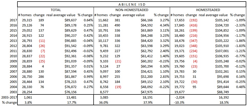
The Abilene ISD data demonstrates this districts receives the greatest share of rental growth. The peak year for adding rentals in the Abilene ISD was 2016 with 490 new rentals. 2017 brought higher lending rates and slowing gains in Abilene ISD rentals; 2017 saw an increase of 381 rentals added to the tax rolls.
In Who Moved My Equity: The Price of AISD Boundary Changes the impact of the 2007-8 closing Lincoln Middle School and the realignment of the middle school boundaries were assessed. It is interesting to note that 2007 is the high water mark for homesteaded homes in the Abilene ISD at 19,783.
If we go back to 2003, we gained 1,061 new homes in the Abilene ISD. Between 2017 to 2003, we gained 3,085 new rentals. The net result is a loss of 2,024 homesteaded homes within the AISD.
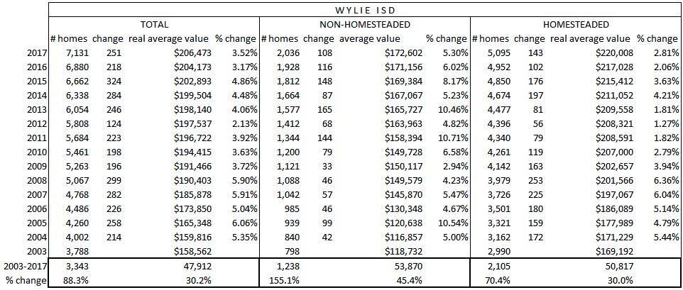
Between 2003 to 2017, Wylie ISD gained 3,343 new homes. 1,238 were added as rentals and 2,105 were homesteaded. In 2017, 108 of the 251 Wylie ISD homes added during the year were rentals. This gain is middle-of-the pack for annual gain in new homes in Wylie ISD – 2015 marked the biggest gain with 324 new homes; 2012 was the slowest year with 124 new homes.
The dollar values expressed in the table are in real terms. The housing Consumer Price Index has been used to adjust reported nominal figures to real figures to aid comparison between years. This data underscores the conventional wisdom that homesteaded homes are worth more than rentals – there’s roughly a $50,000 difference between rentals and non-rental town-wide and in WISD; in the AISD the difference is just under $40,000.
An interesting observation is that since 2003, rental appraisals have grown faster than homesteaded appraisals.
- In Abilene town-wide, rental appraisals grew by 52.4% or $28,182 and homesteaded values grew by 31.8% or $31,607. Rental valuations grew 1.7 times faster than non-rentals,
- In Abilene ISD, rental appraisals grew by 37.9% or $18,191 and homesteaded tax appraisals grew by 18.5% $16,392. Rental valuations grew 2 times faster than non-rentals in the AISD.
- In Wylie ISD, rental valuations grew by 45.4% or $53,870 and homesteaded values grew by 30% or $50,817. Rental valuations grew 1.5 times faster than non-rentals in the WISD.
Several of our landlords say “I just can’t find rentals like I used to”. The growth in the appraised values provides evidence of this. Whatever you want to use to explain it – poor returns on other investments, cheap interest, a steady diet of HGTV shows, – the artifact of increased demand is higher prices. One can assume these appraised values mirror market conditions as landlords are aggressive when contesting taxes, annually evaluating their rentals to reflect market conditions.
The four maps below capture where Abilene rentals are best expressed. Areas transition from a low level of rentals in green, medium density of rentals in yellow and the red zone showing the greatest intensity of rentals.
When mapping rentals, Abilene ISD has Wylie ISD beat 3-to-1. Several Abilene neighborhoods stand out as a preferred location for rentals. Neighborhoods like Lytle South, Abilene Christian University and what is sometimes referred to as the “four-way” are highlighted in red on the map. This indicates an intensity of rentals in this location.
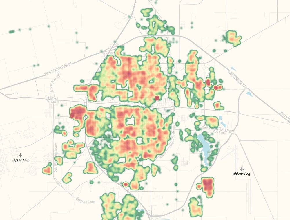
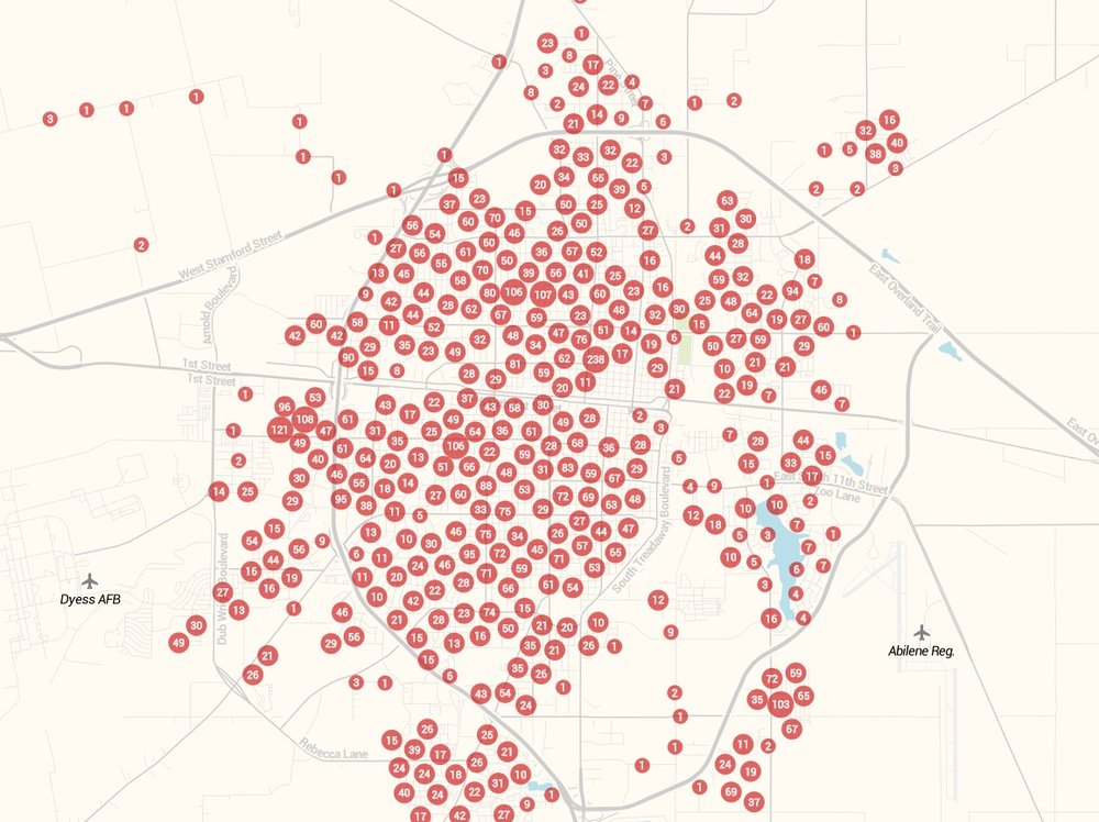
Bubbles with number are used to capture the presence of rentals. Again, Lytle South (count 103) shows the presence of rentals as well as the “four-way” (counts of 121 & 108) and ACU (94). In north Abilene, we see centrally located markers reading 106, and 107 indicating the presence of rentals.
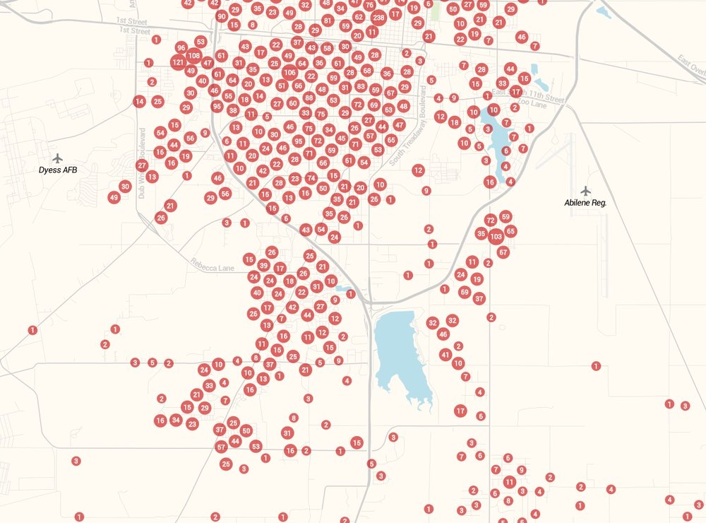
On the southside heat map, we see rentals presented at the condos below Redbud Park and then further south they are slightly manifested in neighborhoods like the Parkside Place addition and Mesquite Forest..
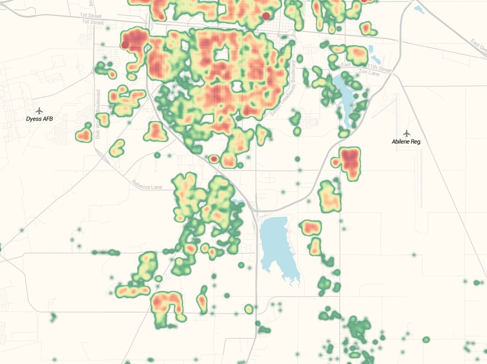
The diffused red intensity at Mesquite Forest and the Parkside Place addition showed that while rentals are present, they don’t dominate the market. The numbers for Mesquite Forest (44/50/53/57) and Parkside Place (46/32/32) demonstrate that rentals are not expressed to the degree of Lytle South and the “four-way”..
Leave a Reply